Running an analysis and using the output panel
To run an analysis, choose “run analysis” from the analysis menu.
The first screen you are presented with is this one:
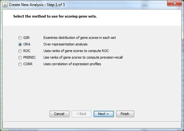
Choose the type of analysis you want to do. Directions on the specific types of analysis are available:
-
General steps and Overrepresentation – start here to read general information about conducting an analysis, with a focus on ORA
(the rest of this tutorial assumes you have run some analysis using the directions)
When you are done with an analysis, the output panel will show the results. Here is the output panel after an analysis. (The standard columns are described here.)

The new column shows the results of your analysis, and the table is initially sorted by this column. Each value is the p value associated with the gene set for that run. The colors indicate classes that passed a multiple test correction. Read details here; currently only gene sets that meet a FDR of 0.1 are in color. You may see a diamond (♦) next to the p-value. This indicates the stability of the result for that group with respect to multifunctionality. Green indicates high stability, red indicates low stability.Details about multifunctionality are given here.
“Not run” means the group was excluded from the analysis, for example if it was too small or too big (outside the range you set) or not in one of the aspects you selected (e.g., Molecular Function groups will be left out if you unchecked that box in the Analysis Wizard).
If you hold the mouse over a p-value for a gene set, a tool tip will be displayed that shows additional information, including the correct number of probes and genes for the gene set as represented in the data you used. Hovering over the heading of the analysis column shows you details about the analysis.
The tree panel
Selecting the tree panel lets you view the results of the analysis in another way:
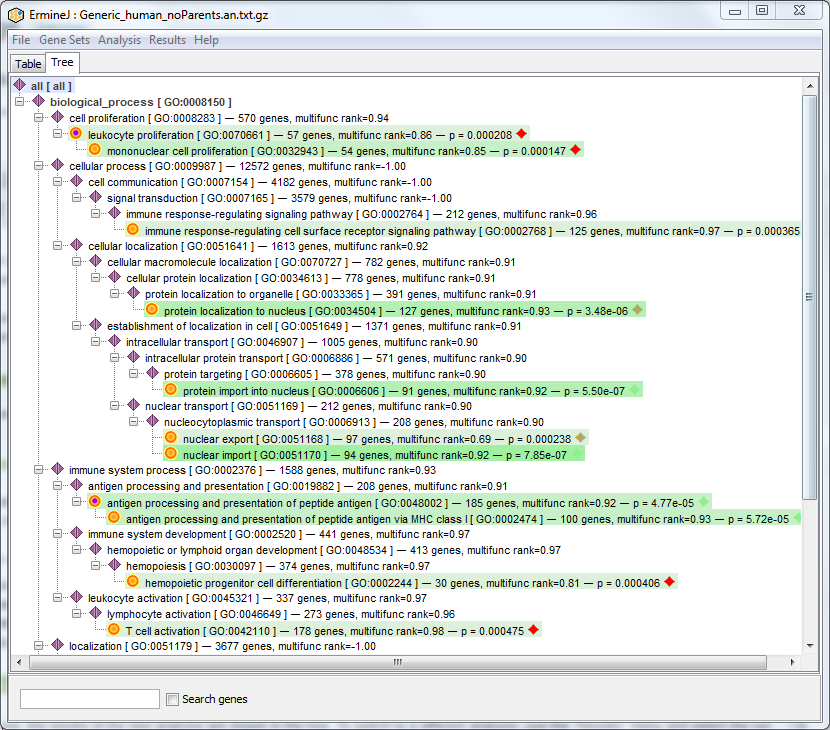
As discussed elsewhere, gene sets that appear in grey italic are empty or redundant with other sets.
The green color-coding has the same meaning as for the table panel – it indicates gene sets that have “good” pvalues. (the specific meaning of the colors is subject to change: currently only gene sets that meet a FDR of 0.1 are in color.)
The icons also have specific meaning to help you find interesting reuslts more quickly:
- Yellow spots indicate that the gene set has a “good” pvalue (it would be shown in color).
- Purple diamonds indicate that the gene set has a child that has a “good” pvalue.
- Yellow spots with a purple center indicate that the gene set has a good pvalue AND it has a child that has a good pvalue.
- Blue squares indicate a gene set that has no children with good pvalues.
Selecting the analysis in the tree view
After an analysis is run, the results of the new analysis are shown in the tree. To switch to a different analysis, use the “Results” menu and select the run you would like to view. If you have done fewer than two analyses, the “Results” menu will be greyed out.
Removing a run
You can Remove a run by right-clicking on its column heading and selecting “Remove this run…”. Note: A known issue is that the table will resort itself after doing this; just click on a header to resort it the way you want.
Renaming a run
You can Rename a run by right-clicking on its column heading and selecting “Rename this run…”. This can be convenient if you have a lot of runs.
Viewing the details of a gene set
You can double-click on a row to get the details for a gene set. For example, to view the details for “GSR run on ‘pvalue'”, “aerobic respiration”, click on the cell in the “GSR run on ‘pvalue'” column on the “aerobic respiration” row. The window you get is explained here.
View information about a gene set on the GO web site
By right-clicking on a row, you will get a pop-up menu. The first item on this menu should open a web browser showing the Amigo web page for the gene set selected.
The other menu item allows you to view or modify the gene set.