Exploring gene set details
From the Output Panel (table or tree), you can double-click on a gene set row to pop up a new window showing the details for the gene set. If you have done multiple analyses,click on the p-value for the specific gene set you wish to view. If you have not done any analysis, you will still see the window. After double-clicking, you will see a new window.
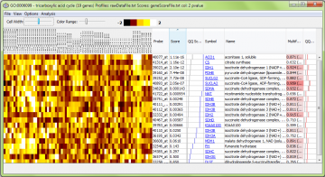
A typical window will look like this
There are a few things to note:
- If you have done an analysis, then the relevant gene score file will be defined, and the probe scores for the probes in the gene set will be displayed. If you have no current analyses, then the last gene score file you used will be selected for showing probe scores. If you have not selected a gene score file, no gene scores will be displayed (you will see “NaN” for “not a number” instead).
- If you have previously loaded your raw expression data, the window will include a visualization of the data. If you have not, you will be prompted to choose a data file. The file format must follow the rules described here. If you choose not to load a data file at this time, you will not be asked again during this session. If you want to see raw data, you can set the data set from a menu option.
- You can open as many visualization windows as you like, including multiple windows for the same gene set.
- You can switch the data set or gene score file to view. This setting is remembered across sessions. If you set these files in the Analysis wizard, that setting will be used. The settings you make here are also remembered.
- The title of the window shows the gene set name, size and the p-value, if there is one
The non-heatmap columns are as follows:
- Probe – the identifier supplied by the array manufacturer, read in from the annotation file. In this example, this is an Affymetrix array.
- Score – the user-supplied gene score (if you have supplied one). This value is loaded from the “gene scores” file. Probes which were present in the array design, but not used for analysis due to lack of a gene score, are shown with a score of “NaN” (not a number).
- QQ Score – a graph showing the scores graphically, to help get an impression of how distributed the effects are through the group. The blue line represents the scores. The grey line shows the expected distribution, based on empirical quantiles of the complete set of scores. If the blue line is to the right of the grey line, then the scores in the set are “generally” better than expected by chance. [Note that in earlier versions of ErmineJ this assumed your scores were p-values and showed quantiles of the uniform distribution.]
- Symbol – the gene symbol as supplied in the annotation file, with hyperlinks to a web site of your choosing. You can change the target URL as described here.
- Name – the gene name as supplied in the annotation file.
- Multifunctionality – indicates the multifunctionality of the gene. The value given is the relative ranking (where 1 is the most multifunctional). The number in parentheses is the number of annotations (e.g., GO terms) the gene has, which is roughly proportional to the multifunctionality, but the exact multifunctionality score takes into account the size of the groups to which the gene belongs. See this page for more information on multifunctionality and how it affects analyses.
- QQ Multifunct similar to the QQ Score column but for the multifunctionality. If the gene set has “typical” multifunctionality, the red line will tend to lie near the grey line.
Image controls
-
Sorting: Clicking on any column (including the raw data column) headers result in sorting of the view.
-
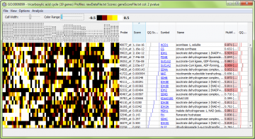
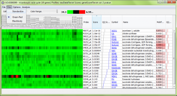
Contrast: You can adjust the color range (contrast) and cell width for the color map.
-
Resize the columns in the image view. Use this to “zoom out” to make the image fit horizontally on your screen.
-
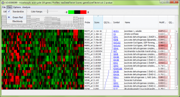
Using the “View” menu, you can switch between different preset color maps and choose standardized or unadjusted data for viewing. “Standardized” means the data are rescaled to have a mean of zero and variance of one, so patterns of genes with different measurement levels can be compared easily.
The Analysis menu
Currently the analysis menu has only one function, to show you information about the distribution of the scores for the genes in the group in the context of the rest of the genes. The window displayed has three tabs:
- ROC – A receiver-operating characteristic curve, showing how the genes in the group rank among the rest of the genes
- PR – Using the same data as in the ROC curve, but displayed as precision vs. recall.
- Histogram – Shows the distribution of scores for genes in group, overlaid with the distribution for those not in the group.
Changing the hyperlinks
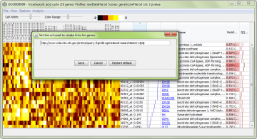
When you click on a gene symbol, your web browser will be opened to a web site of your choosing. The preset is the NCBI “Gene” database, but you can change this using the “Options -> Change gene name URL pattern…” menu item:
Using this requires that you know the URL (web address) for a gene. Just replace the term you would normally put in the URL with two “at” symbols (“@@”). They will be replaced with the Gene Symbol.
For details and some examples, see this page.
Changing the data set
You can switch data sets (or define one if you have never loaded one) viewed in the heatmap by selecting the “Options->Change data set”.
Note: Naturally, if you switch to a data set that uses a different platform (e.g. microarray design), the results might not make much sense. Note that the gene scores displayed are always the ones you used for the last analysis (or the run you double-clicked on) to get this window).
Note: If you switch data sets, the setting is “sticky”: all new visualization windows you open will use this data set, until you switch back.
Changing the gene score file
This is similar to the function for setting the raw data file.
Saving the data and/or image
Using the “File” menu, you can save the data shown, in text (data) or image formats:
Here is an example of the resulting image, which is in PNG format:

You can also save the data using the “File” -> “Save Data…” menu option:
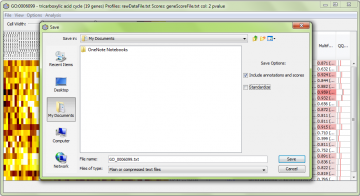
A sample resulting file for the data above is here. In this case we had the “Include annotations and scores” but not “Standardize” checked. This file can be loaded into Excel or a similar program for further analysis.
