This page describes the multifunctionality diagnostics available from the Analysis menu of the main software window. For more information on multifunctionality, see this page.
When you select this menu item, you will get a new window that has three or five tabs and a toolbar. The last two tabs will only appear if you have a gene score file defined. The title of the window indicates which annotations and gene scores are currently active.
The toolbar has one item: “Choose Scores”. This will only be active if you have more than one analysis currently open in the main frame. Use it to switch which gene scores are plotted in the “Score bias” tabs (explained below). Switching also causes that analysis to become active in the main window.
The tabs are:
Set sizes
Displays a histogram of the number of genes per gene set. Values greater than 200 are grouped together in one bin.
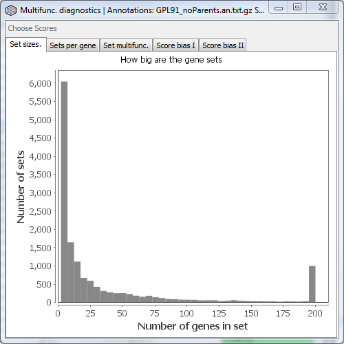
This doesn’t tell you anything about multifunctionality per se, but gives an indication of the range of sizes of gene sets you might want to choose in your analysis.
Sets per gene
Displays a histogram of the number of sets per gene (how many annotations each gene has). Values greater than 200 are grouped into one bin.
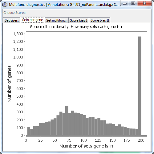
Variability in the number of annotations per gene is the basic definition of gene multifunctionality. In this example, the range is from ~1 to over 200.
Set multifunc.
Displays a histogram of gene set multifunctionality scores, comparable to Figure 1A of our 2011 PLoS ONE paper. The further this distribution is to the right (what we call “multifunctionality bias”), the more overlap there is among your gene sets.

The example above is for an old Affymetrix platform covering about 9000 genes. Your annotations may show more or less bias than this. The stronger the bias, the more important multifunctionality correction is likely to be in your analysis, though the actual need is dependent on the properties of your gene scores, which are plotted in the next two tabs.
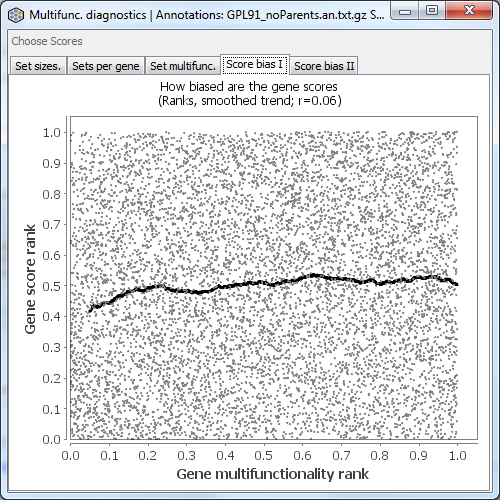
Score bias I
This tab is only shown if you have gene scores. It plots the rank of the gene multifunctionality against the rank of the gene score (taking into account your settings of “log transform” and “big is better”). The black line is a smoothed fit to the data. The rank correlation is displayed above the plot. Even a small positive correlation can indicate a risk of substantial influence of multifunctionality on your analysis.
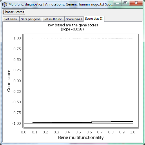
Score bias II
An alternative view of the data underlying Score bias I. This tab is only shown if you have gene scores. It plots the gene multifunctionality against the gene score (taking into account your settings of “log transform” and “big is better”). In contrast, Score bias I shows the rank transformed version of this.

If you are using a “hit list” rather than a continuous gene score (such as p-values), the Score Bias I and II plots will look very different from the examples, because in hit lists the scores only take two values. Here is an example of Score Bias II in such a case.